Weekly ecommerce tips, deals & news.
The decoy effect is a quirk in how people pick between choices. Add a third option that’s worse than one of the first two. Shoppers then shift toward the better of the pair.
Stores use it on pricing pages, feature comparisons, and product listings to nudge buyers toward a target product. The decoy never has to sell. It just has to exist, making a competing option look like the obvious winner.
The decoy effect rests on a behavioral concept called asymmetric dominance. A choice “dominates” another when it’s clearly better on every measure. Asymmetric means the decoy is dominated by one option but not the other.
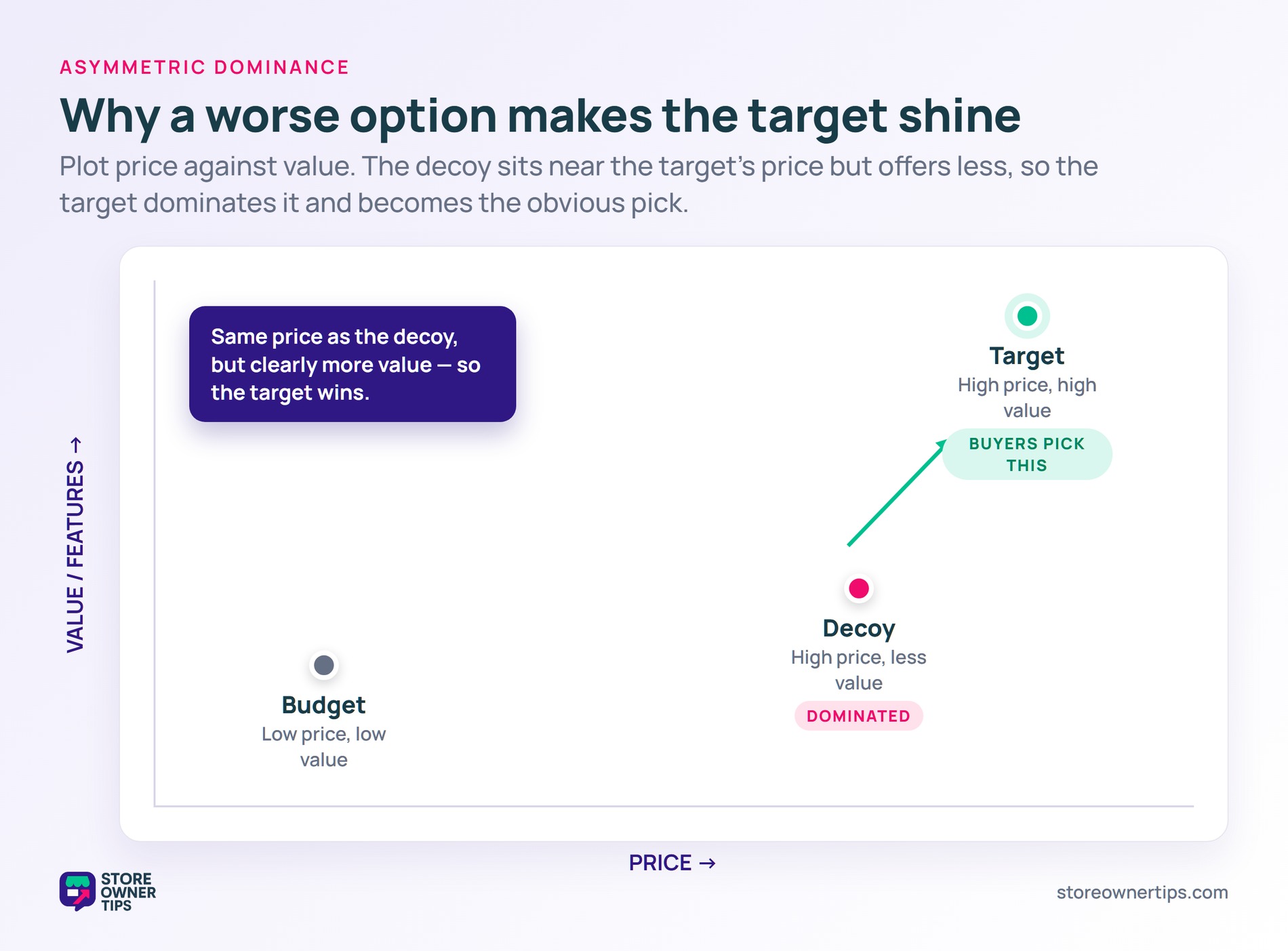
The original paper by Huber, Payne, and Puto landed in 1982 in the Journal of Consumer Research. They showed that adding an asymmetrically dominated alternative increases the probability of choosing the option that dominates it. That violated a long-held assumption in choice theory.
Think of it like a salary negotiation. If your friend already accepted $80,000 and you’re offered $90,000, you look like a winner. Drop the friend’s offer to $60,000, and suddenly your $90,000 looks even better. Nothing about your offer changed.
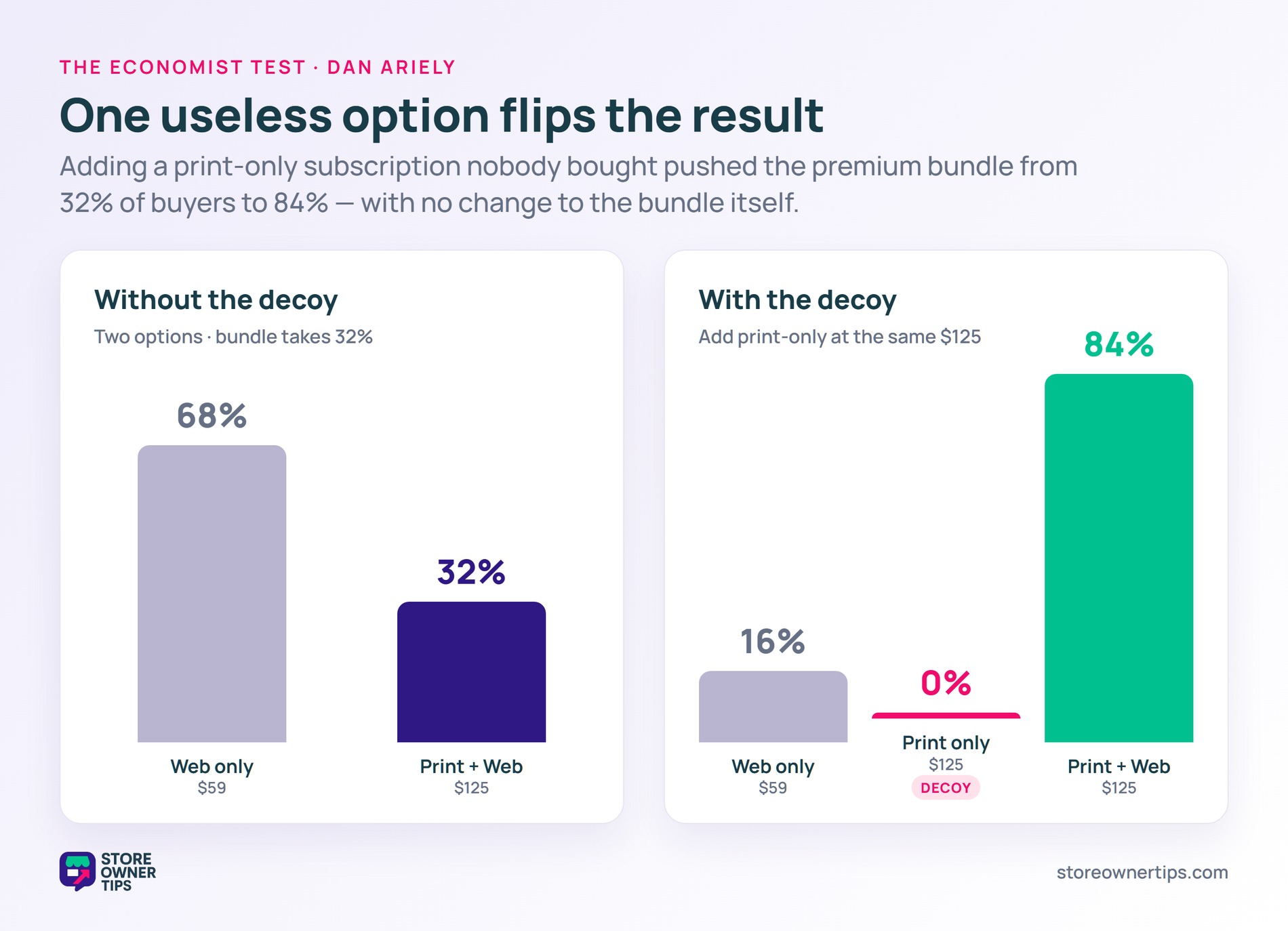
The decoy doesn’t have to be popular. The famous Economist subscription test by Dan Ariely showed a stark shift. With the decoy in place, 84% picked the print-and-web bundle. Without the decoy, only 32% did.
The decoy received zero votes. It still flipped the whole result.
Online stores plant decoys in lots of places. For example, the most common is the three-option pricing layout, where the middle tier exists to push shoppers toward the highest. Wholesale Suite has a deep guide on how three-tier setups translate to wholesale revenue. Most stores reach the decoy idea by accident before they ever read about it.
The pattern works the same way in product listings. Size up the medium, and the large suddenly looks like a steal. Product bundling uses it too. A 2-pack and a 6-pack pull buyers toward the 6-pack when a slightly more expensive 4-pack sits between them.
Feature comparison tables are the white-collar version of the same trick. A row of stripped-down features in the middle column makes the right-hand column read like the only sensible upgrade. Plans pages on most SaaS apps use this exact layout.
The Huber team’s 1982 work tested the effect across six product categories including beer, cars, restaurants, films, and television sets. The decoy worked in five of those six. The exception was lottery tickets, which suggests the effect needs an evaluable trade-off to function.
Plus, the lever isn’t limited to digital pages. Brick-and-mortar stores use decoys on shelves, comparing price-per-ounce options to push the middle SKU. The principle holds whether you’re scanning a website or a grocery aisle.
Not every decoy lands. The most common failure is making the decoy too obviously bad. Shoppers spot a setup and feel manipulated, which kills trust. The decoy needs to be plausible, even if it’s clearly less attractive than the target.
The effect also weakens when the choice is emotional or values-driven. For example, donations to charities, picks based on personal taste, and high-trust purchases don’t follow the same pattern. People reach those decisions through different mental shortcuts.
A third failure mode is overuse. Sprinkle decoys across every page and shoppers learn the pattern. Once they catch on, the trick stops working, and the whole catalog can start to feel manipulative.
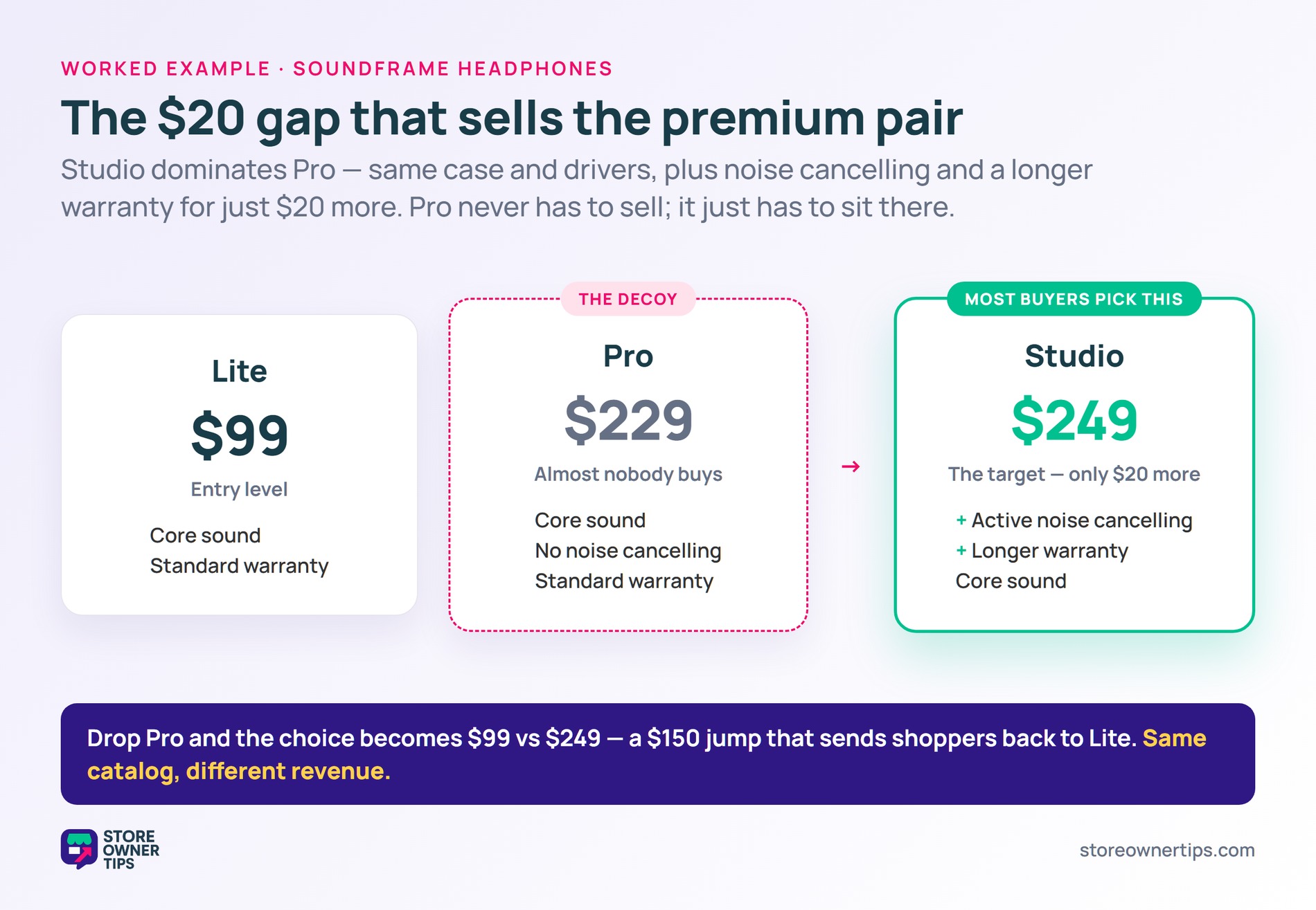
Picture a mid-sized headphones brand called Soundframe. They sell three tiers on their pricing page: Lite at $99, Pro at $229, and Studio at $249.
Lite is the entry-level pair. Studio is the premium target. Pro sits in the middle as the decoy. Pro has fewer features than Studio for almost the same price.
The trick: Studio dominates Pro. Same case, same drivers, but Studio adds active noise cancellation and a longer warranty. The $20 gap looks tiny next to what Studio delivers.
When shoppers see Pro and Studio side by side, the $20 leap feels like a no-brainer. Most pick Studio. A few outliers go with Lite. Almost nobody picks Pro.
If Soundframe removed Pro, the choice would simplify to Lite at $99 or Studio at $249. The $150 gap suddenly looks much larger. Shoppers who would have bought Studio with the decoy now default to Lite. The price jump no longer feels small.
The total revenue picture also shifts. With Pro in place, Soundframe sells more Studios at $249. Without Pro, more shoppers pick Lite at $99. The same product catalog, same store, different revenue.
That’s the decoy effect in action. Pro never had to sell. It just had to exist.
Anchoring and the decoy effect get lumped together but work differently. Anchor
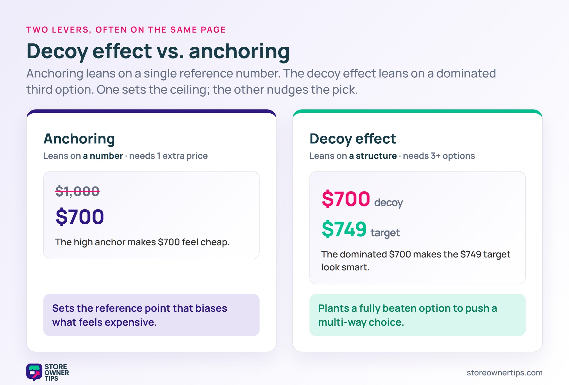
Anchoring leans on a number. The decoy effect leans on a structure. A $1,000 anchor price makes a $700 product feel cheap. A $700 decoy makes a $749 target look smart.
Stores use both, often in the same pricing page. Anchoring sets the ceiling. The decoy nudges the pick.
It depends on the setup. A decoy that creates honest contrast between real options is just choice design. A decoy that exists only to trick people into spending more crosses a line.
The simplest test is whether the decoy is a real product or plan that someone could actually want. If yes, it’s choice architecture. If no, it’s a pricing illusion.
Yes, and it doesn’t need a special plugin. The decoy effect is about how options are arranged, not how they’re priced. Any pricing page, product comparison, or variable-product setup can use it.
The simplest version is the three-tier pricing layout, where the middle option is dominated by the highest one. Bundle quantity setups work the same way. The setup lives in your tier pricing structure, not in plugin code.
Both use context to nudge a decision, but the mechanisms differ. Anchoring uses one reference number that biases what feels expensive or cheap. By contrast, the decoy effect uses a structurally dominated alternative to push the pick.
Anchoring needs just one extra number. The decoy effect needs at least three options. Stores combine them all the time, but the two levers are separate.
The decoy effect is one of the cleanest examples of how context shapes choice. A single extra option, carefully placed, can reshape what most shoppers buy. The lever costs nothing to add. Used honestly, it lines up real value with the products you most want to sell.
Copyright © StoreOwnerTips.com. All Rights Reserved.
