Weekly ecommerce tips, deals & news.
The paradox of choice is when too many options make people decide worse, or not at all. Stores see this when shoppers face a long product list and leave without buying. The pull works in reverse too.
Curated picks, smart filters, and clear recommendations help shoppers commit. The lesson isn’t to cut every option. It’s to design the choice so the next step feels obvious to most shoppers.
The paradox of choice landed in mainstream conversation with Barry Schwartz’s 2004 book of the same name. The roots go back further to a 2000 field study by Sheena Iyengar and Mark Lepper. They set up two jam tasting tables in a grocery store. One offered 6 flavors, the other 24.
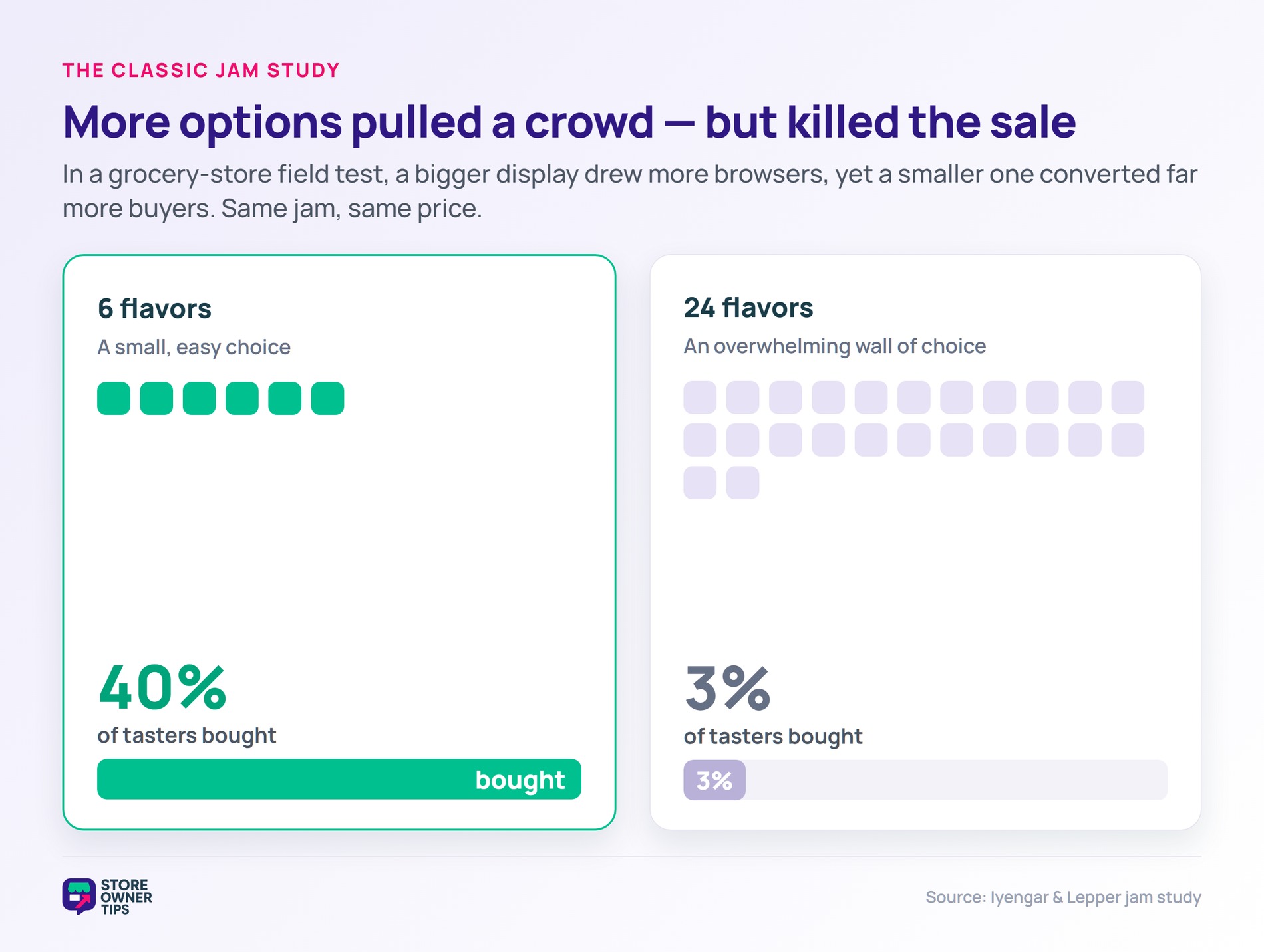
The 24-jam table pulled more foot traffic. However, the 6-jam table converted far more sales. Shoppers facing 6 jams bought roughly 40% of the time, versus only 3% at the 24-jam table. Same product, same price, more decisions tanked the result.
In short, the mechanism is mental fatigue. Each option adds a comparison the shopper has to make. Once enough comparisons stack up, the brain shortcuts to “I’ll come back later,” which usually means “I’ll never come back.”
The classic jam result inspired a wave of follow-up studies. A 2010 meta-analysis of 63 conditions across 50 experiments (N=5,036) found an overall mean effect size of virtually zero. In some replications, more options helped. However, in others they hurt, suggesting the effect isn’t a universal law.
That same analysis found wide variance between studies, not a flat result. In other words, choice overload IS real, but it switches on only under specific conditions. The job for a store owner is spotting when those conditions apply.
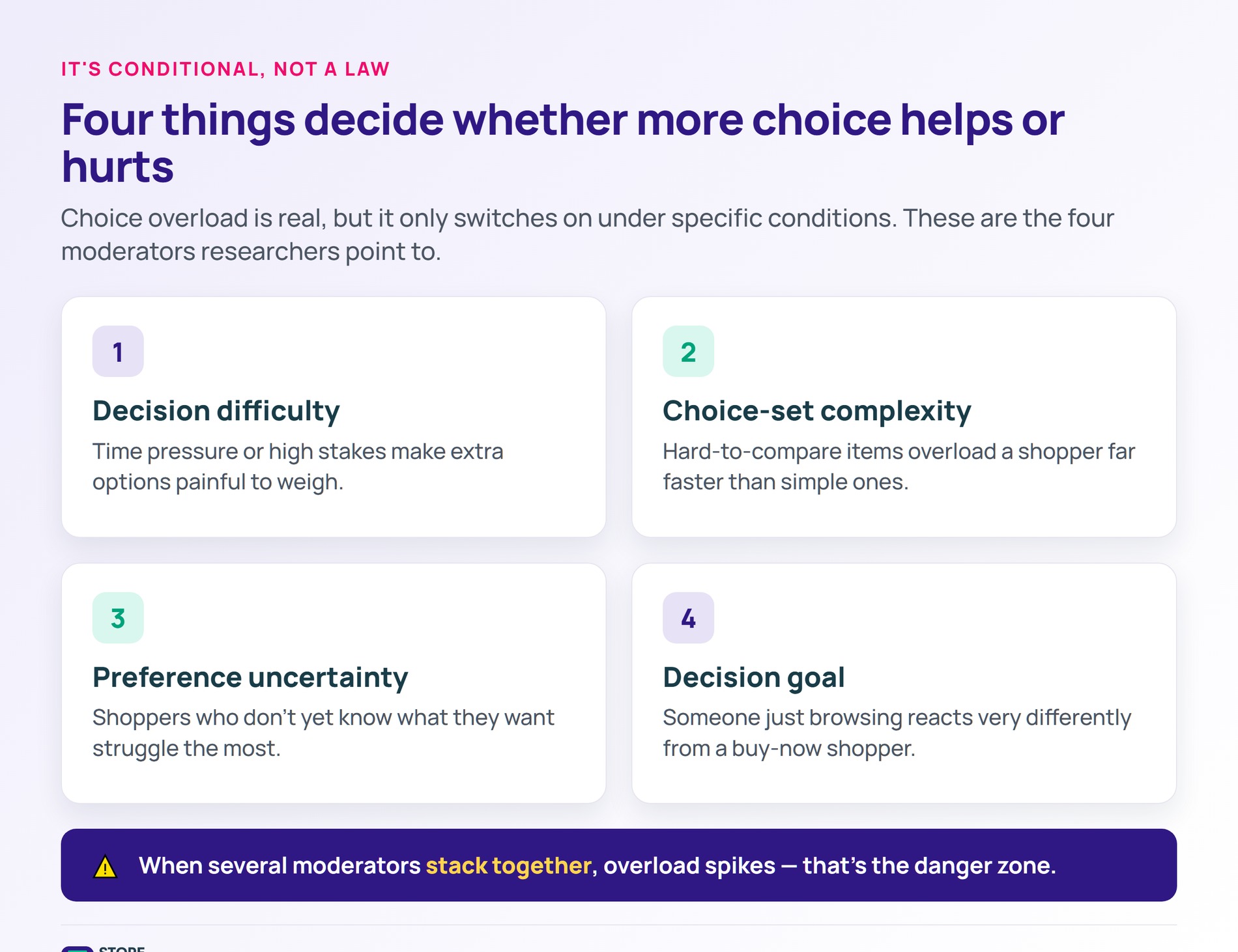
Researchers point to four big moderators that decide whether more options help or hurt. The first is decision difficulty: time pressure or high stakes make extra options painful. The second is choice-set complexity: hard-to-compare items overload faster than simple ones.
The third moderator is preference uncertainty: shoppers who don’t know what they want struggle most. The fourth is the decision goal: someone just browsing reacts differently from someone ready to buy now. When several moderators stack together, overload spikes.
Plus, plenty of shoppers actively want more options. People with strong preferences, deep product knowledge, or a clear use case often handle large assortments fine. The pain falls hardest on the casual, time-pressed, or first-time buyer.
Online stores hit the paradox in obvious places. First, a long product listing page with no filters. As a result, shoppers see 200 SKUs, can’t sort them, and bounce. The fix isn’t fewer products: it’s better navigation.
Next, the same effect shows up at checkout. Too many shipping options, payment methods, or upsells can tip a confident shopper into abandoning the cart. Baymard puts the baseline at 70.22%, and decision overload sits on top of price and shipping concerns.
Subscription and plan pages also struggle when feature columns blur together. If shoppers can’t tell what makes “Basic” different from “Pro,” they tend to bounce. Crisp comparison tables and a clear social proof tag like “most popular” pull people through the decision.
A few moves consistently help. Cut, group, default, and recommend. Each one shrinks the visible choice without removing the underlying product.
First, prune the dead weight. SKUs that never sell add noise without revenue. Second, group similar products into clear categories with crisp filters that let shoppers narrow fast.
Third, set sensible defaults on every page so the easy click is the right click. A pre-selected size or the “recommended” plan removes a decision the shopper would otherwise sweat. Fourth, use guided selling: short quizzes or “help me choose” flows that hand-hold unsure buyers to one good answer.
On top of that, product recommendations are one of the strongest counters to choice overload. AdTribes has a guide on using ecommerce product recommendations to boost sales. The pattern works because it cuts the decision down to a handful of curated picks the shopper trusts.
Save-for-later features add a final move: let shoppers exit the choice without leaving the store. They come back when they’re ready, which beats a hard bounce. Curated collections and editorial “staff picks” do similar work by framing one short, confident list.
Picture a mid-sized online running shoe store called Sprintly, running on WooCommerce. Their bestselling category page lists 80 shoes across 20 brands. The page shows everything in a single grid.
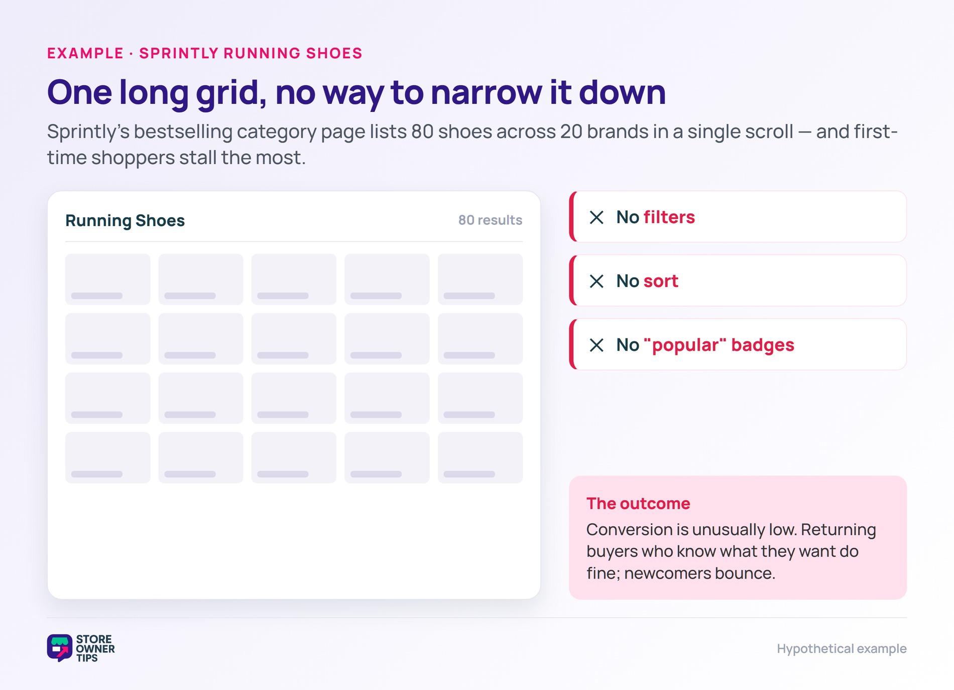
No filters, no sort, no “popular” badges. Just a long scroll.
Visitor analytics show conversion is unusually low on this page. First-time shoppers stall the most. Returning customers, who already know what they want, do far better.
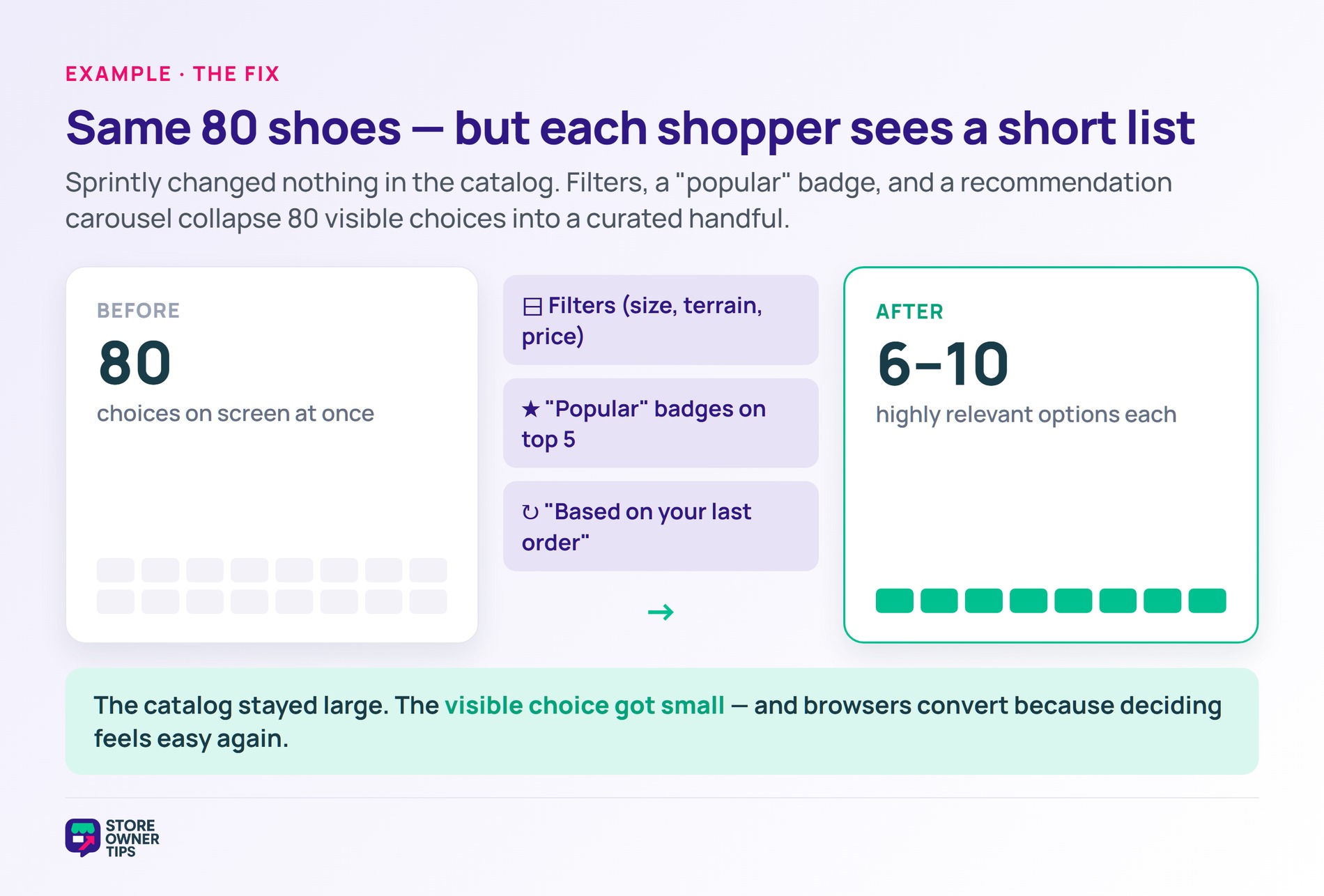
Sprintly rebuilds the page in three steps. First, they add filters for size, terrain, gender, and price. Second, they tag the top 5 sellers with a “popular” badge. Third, they surface a “based on your last order” carousel for returning shoppers.
Nothing changes in the actual product catalog. In fact, the page still shows 80 shoes, just filtered and ranked. Each visitor now sees a default subset of 6 to 10 highly relevant options.
The jam study is the benchmark here. It showed a jump from a 3% buy rate on the big display to roughly 40% on the small one. Sprintly isn’t chasing that exact multiple, since a real catalog is messier than a jam table.
Still, the direction holds. By collapsing 80 visible choices into a curated handful per shopper, the page mirrors the smaller, easier display. Browsers convert because the choice now feels small. The fix wasn’t to cut the catalog: it was to make the choice feel smaller.
Yes, with caveats. The classic jam study showed a clear effect. Later meta-analyses found the average effect across all studies is close to zero. Still, choice overload IS strong when shoppers are unsure, comparisons are complex, or the decision feels high-stakes.
In practice, those conditions describe most ecommerce product pages. Unsure shoppers, dozens of variants, and high prices all push toward the overload zone. The phenomenon is real for the audience that matters most: the casual visitor.
There’s no magic number. Iyengar’s classic study saw the drop-off between 6 and 24 options. Most ecommerce research suggests the danger zone starts when the visible set crosses what fits comfortably on one screen.
That’s why filters matter so much. Even with 200 SKUs in the catalog, a well-filtered view feels like a short, decisive list. In practice, the total catalog can stay large as long as the choice each shopper sees stays small.
Largely yes, when they’re built well. Good filters let shoppers slice a big catalog into a personal short-list in seconds. Search does the same for shoppers who already know what they want.
However, where they fail is on shoppers who don’t know what they want. Those visitors need curation, not tools. Recommendations, “most popular” tags, and editorial picks do the heavy lifting for that group.
People use the two terms loosely, but there’s a slight split. The paradox of choice is the broad idea that more freedom can lower satisfaction. Choice overload is the narrower, testable effect researchers measure in studies.
For a store owner, the distinction rarely matters day to day. Both point to the same fix: shrink the visible decision without gutting the catalog. The fear of missing the “perfect” pick, a cousin of FOMO, often makes the overload worse.
The paradox of choice is one of the most-cited findings in behavioral economics, and one of the most-misunderstood. The effect is real, but conditional. Smart stores don’t cut their catalog. They redesign the visible choice so the next step always feels obvious.
Copyright © StoreOwnerTips.com. All Rights Reserved.
