Weekly ecommerce tips, deals & news.
Form abandonment is when somebody starts filling in a form on your store and leaves before submitting it. They wanted the thing on the other side. Something in the form itself stopped them.
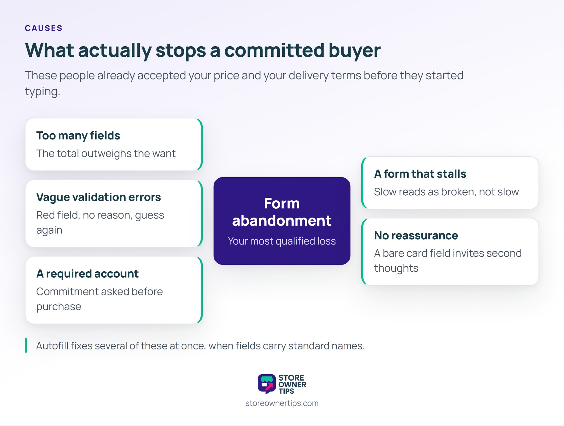
So form abandonment is the most qualified loss on your site. These are not browsers who drifted in. They had already decided, and then your fields talked them out of it.
Form abandonment works as a running trade the visitor keeps re-evaluating. Think of every field as a small toll on the way to something they want. So each one is fine until the total feels worse than leaving.

Form abandonment climbs with the number of things you ask for. Baymard’s benchmark of top e-commerce sites found the average checkout carries 11.3 form fields. Its research puts the number most sites genuinely need at eight.
In practice, the surplus is made of habits rather than requirements. For example, split name fields, a second address line and a company field are usual suspects. Meanwhile a phone number is often collected because a form template included one.
Still, every field also carries a chance of an error. So trimming three fields removes three chances to reject somebody. That is the quiet reason shorter forms convert better.
Mobile makes every one of those fields more expensive. Typing on a phone is slower, and the wrong keyboard type turns a postcode into a struggle. So the field you tolerate on desktop is the one costing you mobile orders.
Form abandonment spikes hardest at the moment of a validation error. Then a field turns red, the reason is vague, and the visitor has to guess. Guessing wrong twice is where most people give up.
Meanwhile the common offenders are easy to find once you look. Phone fields that reject spaces, postcodes that reject a valid format, and card fields that clear themselves on error. Then there are forms that wipe every entry after a failed submit.
Also, timing matters as much as wording here. Validating a field as somebody leaves it beats waiting for the submit. In practice that one change converts a dead end into a small correction.
Autofill deserves a mention because it solves several problems at once. Fields labelled with standard names let a browser complete a whole address in one tap. So the shortest form is often the one a visitor barely types at all.
Form abandonment is often caused by something next to the form rather than in it. For example, a required account asks for commitment before the purchase. Baymard finds 18% of abandonments come from a site wanting shoppers to create an account.
Then speed belongs in this group too. A form that stalls between steps gets read as broken rather than slow. Deloitte measured a 0.1 second mobile speed improvement lifting retail conversions by 8.4%.
Meanwhile trust signals sit in the same category. A card field with no reassurance next to it invites second thoughts. Offering guest checkout removes the single most common blocker of the lot.
Form abandonment has been measured more carefully than most conversion problems. Baymard Institute runs an ongoing usability benchmark of hundreds of top e-commerce sites, backed by large-scale user testing. Its field-count work is the most useful starting point for a store owner.
The benchmark also explains why averages stay stubbornly high. Most of the surplus fields are defaults nobody revisited after launch. So a store can usually cut three of them without a single product decision.
The gap between the average checkout and a lean one is roughly three fields. That sounds small until you count what each field costs. Every one is a decision, a typing task and a possible error message.
The reasons shoppers give also point inward rather than outward. Forced account creation and a long or complicated process both rank high in Baymard’s abandonment reasons. Neither is about price, and both are yours to fix.
Form abandonment in practice hides behind a checkout conversion rate nobody can explain. Here is a hypothetical example. Picture a store selling art supplies, with a wholesale application form for trade accounts.
In this scenario, the application asks for 17 fields on a single page. Among them are a business number, a resale certificate upload and two trade references. All of them are marked required.
Then, each month, around 240 people start the form. Just 34 finish it. Nobody knows where the other 206 stop.
So the store reads 34 applications a month as weak wholesale demand. So the next budget goes into ads aimed at trade buyers. That doubles the people arriving at a form they still cannot finish.
Meanwhile the applicants who do complete it are the most patient, not the most valuable. Several large buyers had abandoned at the reference fields. Still, none of that appears anywhere in a report.
First, the store adds field-level tracking so it can see the last field touched. Two thirds of abandonments turn out to happen at the trade references. Those were required out of caution rather than necessity.
Next, references become optional and the certificate upload moves to after approval. Next, the form splits into two short steps with a progress indicator. Even so, the total number of questions barely changes.
As a result, completions climb to 96 a month on the same traffic. In short, the demand was always there and the form was eating it. Advice on removing friction across a store covers the same principle beyond checkout.

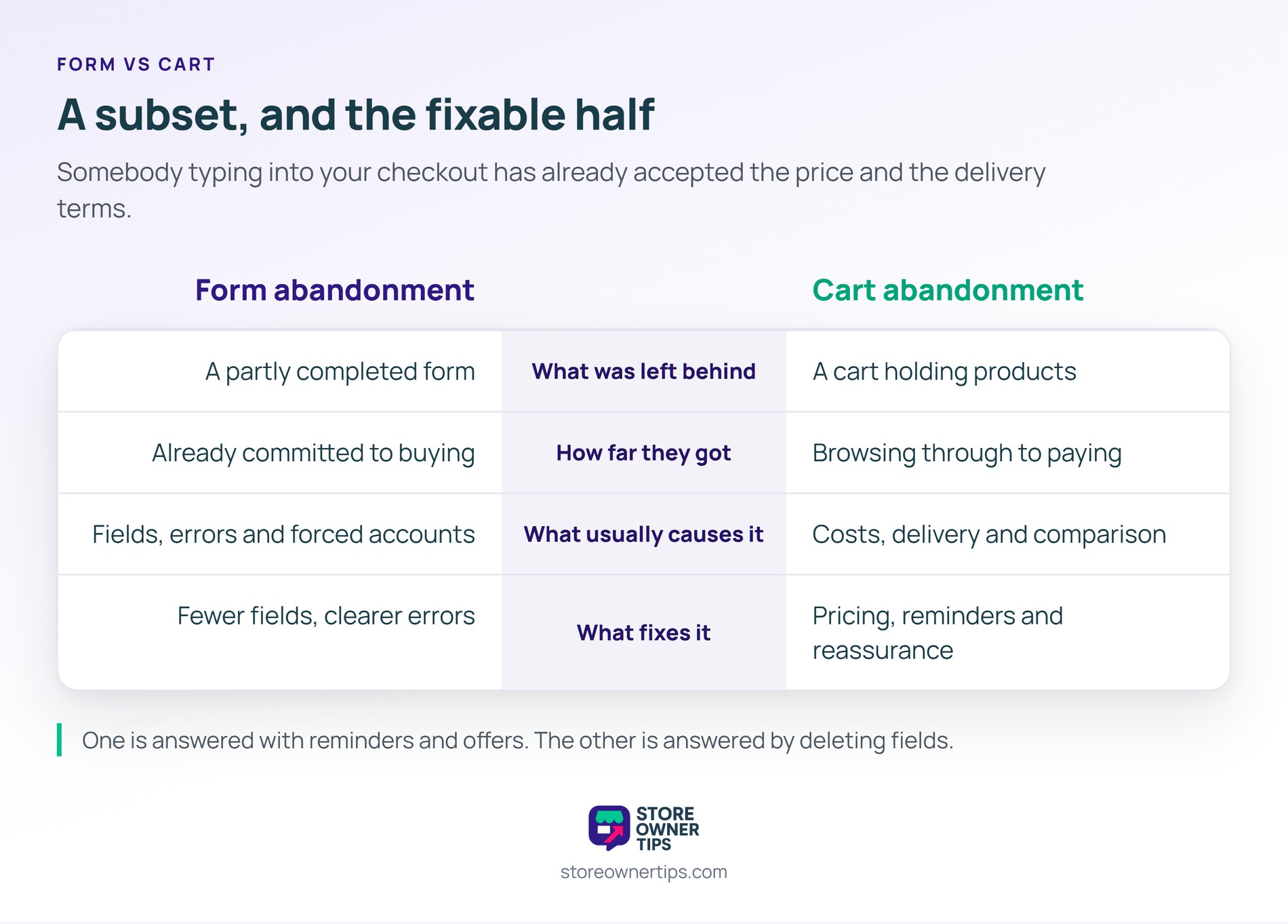
| What you are comparing | Form abandonment | Cart abandonment |
|---|---|---|
| What was left behind | A partly completed form | A cart holding products |
| How far they got | Already committed to buying | Anywhere from browsing to paying |
| What usually causes it | Fields, errors and required accounts | Costs, delivery and comparison shopping |
| What fixes it | Fewer fields and clearer errors | Pricing, reminders and reassurance |
Form abandonment is a subset of the wider problem, and the most fixable part of it. Somebody typing into your checkout has already accepted your price and your delivery terms.
That is why the two deserve different responses. Cart abandonment is often answered with reminders and offers. By contrast, form abandonment is answered by deleting fields.
Still, the two belong in one report rather than two. Somebody who gives up inside your checkout form is also abandoning a cart. Counting them separately is what stops you seeing which half you can actually fix.
First, track the last field a visitor interacted with before leaving. Most analytics tools can record field-level events on a form. That single measure turns a mystery into a shortlist.
Also log validation errors by field name. A field that throws errors constantly is usually the one ending sessions.
So aim for the smallest set that lets you take payment and ship the order. Baymard’s research points at around eight fields for most stores. Anything beyond that needs a reason you could defend out loud.
A good test is to ask what you would do with each answer. If nothing in your process uses it, the field is decoration.
Preserving entries within a session is straightforward and always worth doing. Nobody should have to retype an address because one field failed. That alone recovers a meaningful share of attempts.
Storing a partial form to email someone later is a different question. Get consent before you do it, and be careful what you keep.
Form abandonment matters because it loses the people who had already said yes. Every other conversion problem happens before that point, which makes this the cheapest ground you own. Plus the work is usually deletion rather than design.
In short, count your fields before you buy more traffic.
Copyright © StoreOwnerTips.com. All Rights Reserved.
