Weekly ecommerce tips, deals & news.
A heatmap is a color-coded picture of how visitors behave on a web page. It shows where people click, how far they scroll, and where their attention lingers. Warm colors like red and orange mark busy spots, while cool blues mark areas people ignore. For store owners, it turns invisible browsing habits into a clear visual map you can actually read.
Think of a heatmap like a worn path across a grass lawn. Where people walk most, the grass thins and a trail appears. A heatmap does the same thing for your store, but with color instead of dirt. It collects thousands of small actions and paints them onto a snapshot of your page.
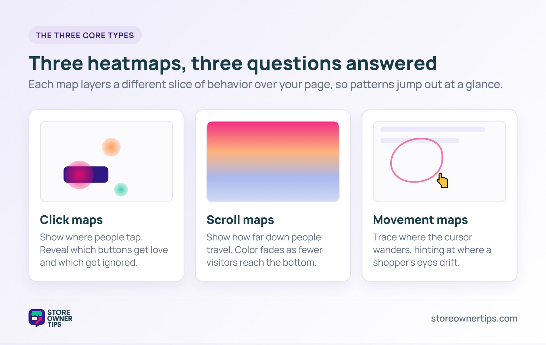
The point is simple. You cannot fix what you cannot see. A heatmap takes the invisible choices shoppers make and turns them into something you can study over morning coffee.
The data comes from a small piece of tracking code on your site. On WooCommerce or Shopify, this is usually a lightweight script you add once. It quietly records anonymous interactions, then your heatmap tool stacks them all together into one visual.
That stacking is the magic part. One person’s click means little on its own. Thousands of clicks layered together reveal a pattern no single visit could show.
When a shopper clicks, the script saves the exact spot they touched. It also logs the element, like a button or an image. Over time, those points pile up into clusters.
The tool then blends those clusters into smooth color gradients. Busy zones glow red, quiet zones stay blue. Because the data is anonymous and aggregated, you see group behavior rather than any single person.
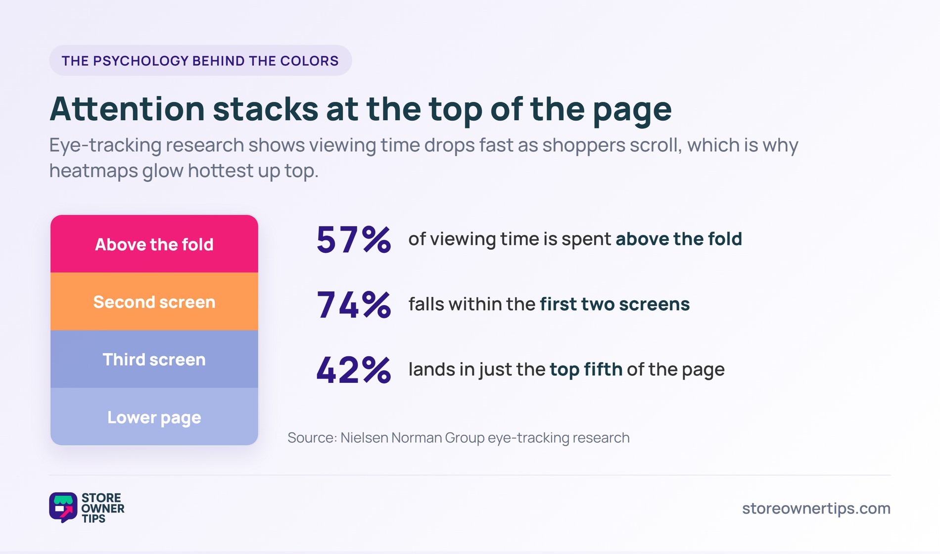
Heatmaps work because attention is not spread evenly. Eye-tracking research from Nielsen Norman Group found users spend about 57% of their viewing time above the fold. Another 74% falls within the first two screens.
In short, the top of your page does most of the selling. A heatmap makes that lopsided reality visible. As a result, you stop guessing where to place your best offers and start placing them where eyes already land.
Scroll maps catch a sneaky problem too, often called the “false bottom.” This happens when a design element looks like the end of a page. Shoppers assume there is nothing more and stop scrolling.
Picture a long hallway with a fake wall painted halfway down. People turn back, sure they have reached the end. A scroll map shows you exactly where that fake wall sits. Then you can tear it down and guide visitors deeper into your store.
Some pages reward heatmap attention more than others. Product pages, the homepage, and the checkout flow are the heavy hitters. These are the spots where small layout fixes move real money.
The reason is traffic plus intent. These pages get plenty of visitors, and those visitors are close to buying. So even a tiny improvement here ripples across your whole store.
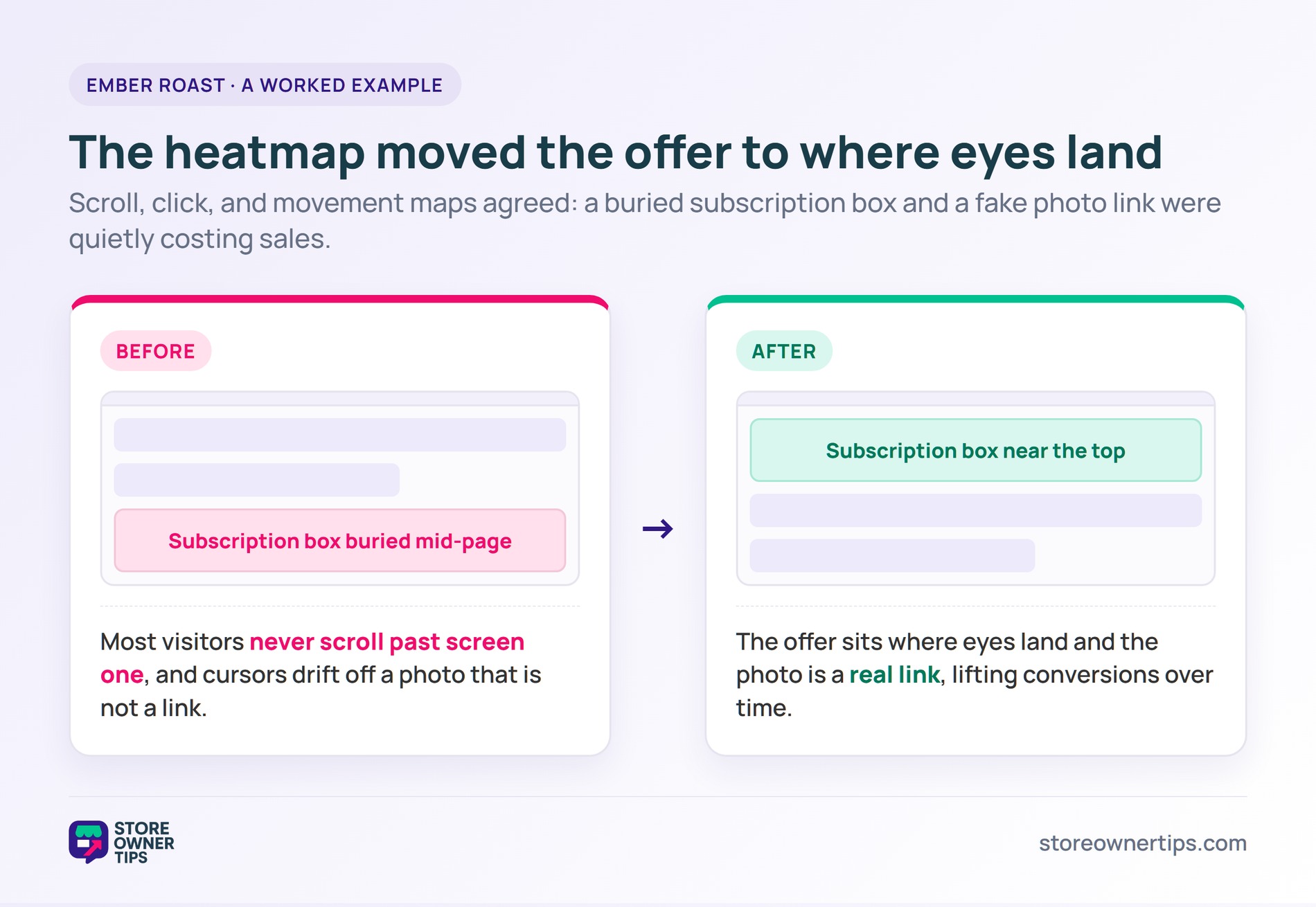
Imagine a mid-sized coffee roasting brand called Ember Roast. Their best-selling subscription box sits halfway down the homepage. Sales feel soft, and nobody on the team knows why.
The team installs a heatmap tool and waits two weeks. The scroll map tells a hard truth right away. Most visitors never travel past the first screen, which lines up with research showing only 42% of viewing time lands in the top fifth of a page.
The click map adds another clue. Shoppers keep tapping a product photo that is not even a link. That wasted tapping is a classic sign of a “false affordance,” a design that looks clickable but does nothing.
The movement map fills in the last gap. Cursors cluster around the photo, then drift away in frustration. Together, the three maps paint one clear story about a buried, confusing offer.
Ember Roast moves the subscription box near the top. Then they turn the popular product photo into a real link. Both changes come straight from heatmap evidence, not opinion.
The payoff matters because abandonment is brutal in this industry. Baymard pegs the average cart abandonment rate at 70.22%, drawn from 50 studies. Every shopper who finally sees the offer is one fewer lost to a confusing layout.
Over a month, those small wins add up. The team did not buy more traffic or run new ads. They simply rearranged what they already had, guided by what the heatmap showed, which lifts their conversion rate over time.
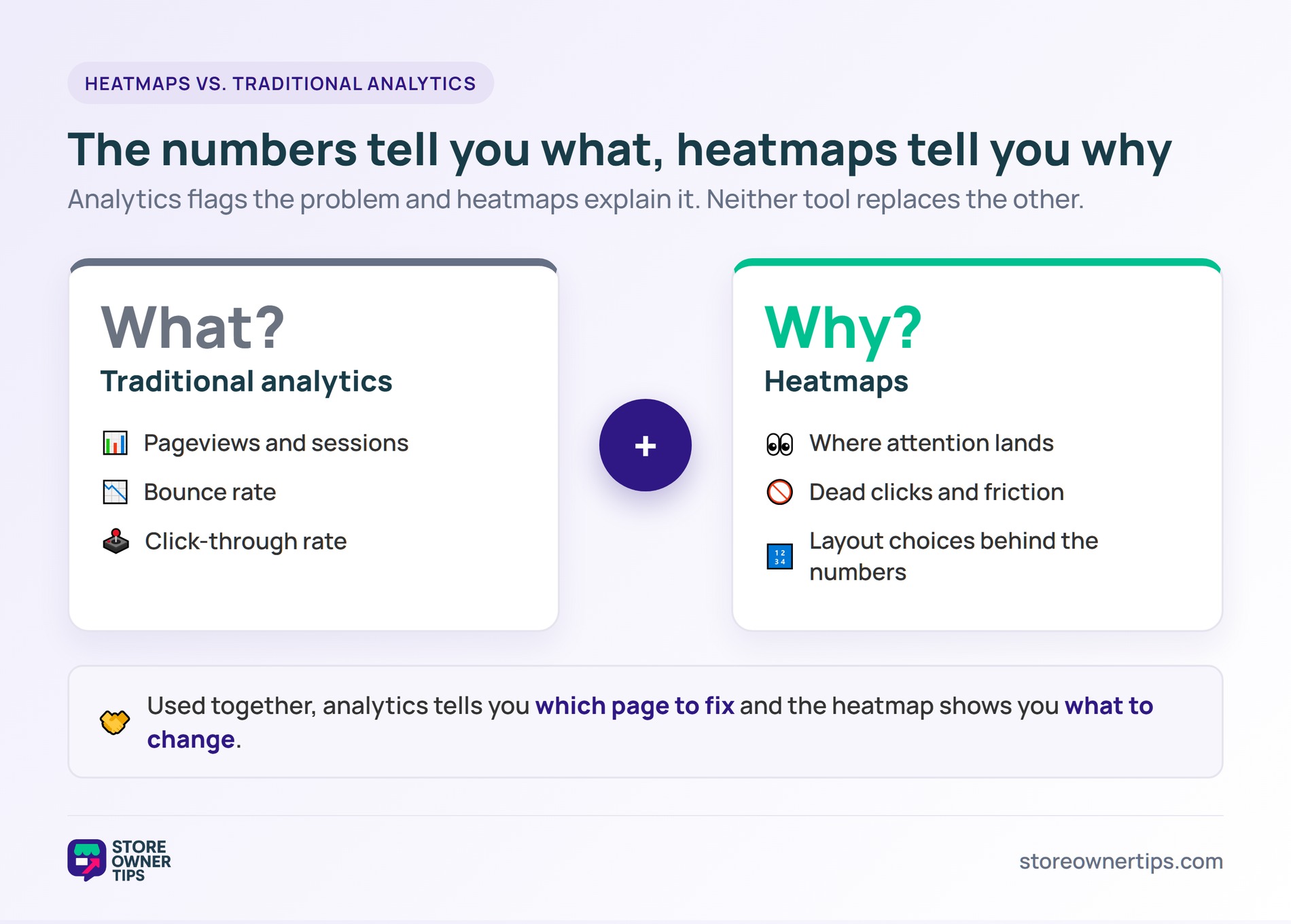
Traditional analytics tells you the numbers. It shows pageviews, bounce rate, and your overall click-through rate. In other words, it answers “what” happened.
Heatmaps answer “why” it happened. They show the layout choices and friction points behind those numbers. By contrast, a spreadsheet of pageviews can never tell you a button was invisible.
The two work best as a pair. Analytics flags the problem, and the heatmap explains it. For example, your data might show a product page losing sales. Then the heatmap reveals shoppers never scroll to the buy button.
Neither tool replaces the other. Numbers without a visual leave you guessing at causes. A visual without numbers leaves you unsure which page to fix first.
A common rule is at least a few thousand sessions per page. With too few visitors, the colors reflect noise instead of real patterns. For low-traffic pages, let the map run longer before you trust it. A slow page can still gather solid data over several weeks.
Most modern tools load asynchronously, so they rarely hurt speed. Still, you should test your page after adding any script. On WooCommerce or Shopify, keep an eye on load time during checkout especially. A fast site protects both your rankings and your sales.
Good heatmap tools collect anonymous, aggregated data only. They should mask sensitive fields like passwords and payment details. Always check the tool’s settings and your privacy policy to stay compliant. When set up right, a heatmap watches behavior without ever exposing a single shopper.
A heatmap turns silent browsing into a clear picture you can act on. It shows where attention goes and where it gets stuck. For any store chasing steady growth, that visual evidence is one of the cheapest ways to find and fix the leaks costing you sales. Start with your highest-traffic page, watch the colors, and let the data guide your next change.
Copyright © StoreOwnerTips.com. All Rights Reserved.
